What'sNext Service Concept

Service Design
Research
UX/UI
My Role

Service Design Student

Time

February-April 2025

Organization

Carnegie Mellon University

Tools

Figma

Contribution

Research, Brand, UX/UI, Presentations

Credits

Sarah Chen & Alec Chen

OVERVIEW
Many people visit Pittsburgh for business or academic events. However, visitors can miss out on truly connecting with the city because they don’t know about unique local spots nearby.

What’sNext is a service concept for city visitors with downtime to quickly orient them towards a local business, park, or other attraction within walking distance. Without the guesswork and choice paralysis of map apps, the only question left is, “What’s next?” 

As part of a Service Design seminar at CMU, I worked with two other students to research the problem area, ideate on solutions, evaluate a service prototype, design touchpoints, and present our service concept. Each of us was involved in every part of the process; I did the final work on the branding and screen-based UI design. 
FEATURES
01
Fast, local, focused recs
Users need to know when moments occurred and what information they contain. Cards display the time of a story moment and the types of information visible in each entry.
Kiosks & Webapp
Users need to know when moments occurred and what information they contain. Cards display the time of a story moment and the types of information visible in each entry.
Discounts & Chaining
Users need to know when moments occurred and what information they contain. Cards display the time of a story moment and the types of information visible in each entry.
HOW MIGHT WE HELP PEOPLE FEEL CONNECTED TO PLACES?
FORMATIVE RESEARCH
02
Interviews
We started off by conducting 30 interviews with diverse participants about their personal connections to the places where they lived.
“When I move to a new place, I explore a lot and make sure I find the pockets that feel like home to me. And so I've done a lot of that in Pittsburgh, and that way, it helps me feel connected by knowing what's around, I guess, like getting a familiarity with the space that helps me feel like I know and feel connected to it. I'm like, oh, that cafe that I researched is over there, and, like, that really cool library is over here, and I sort of see it as a map in my head.”
Interviewee, early 30s, female, grad student
From there, we narrowed in on the concept of connecting to local routing knowledge: where to go in a place, and how to get there. Some locals might be “in the loop,” but newcomers or visitors might not be. This might be preferable for the locals, of course. However, as students from out of state, we were sympathetic to this problem.
Twelve illustrated sticky notes in four rows and three columns: yellow notes depict a person watching TV, puzzled by a flag, navigating streets, ice cream sign, walking arrow, and holding ice cream; blue notes show conversations, a register, a person at a door, two people talking, and cooking; orange notes illustrate a bar sign, person with a phone, event ticket, a map, planning a route, and excitement about a place; red notes portray a person with confusing thoughts, exclamation by a kiosk, ordering food, using a phone, walking away, and happy group with scissors cutting hair.
Concept Sketching & Feedback
We sketched four potential service storyboards and got feedback via “speed dating” with other student groups. While some participants reacted positively to ideas involving physical signage, it became clear to us that our concept for digital routing was the most robust of the four. 
Competition
We explored other services connecting people to places. The space was not without competitors; several apps existed which aimed to provide navigation to businesses with some sort of human factor (Google Maps and reviews), or which focused on connecting people with a geographic element (Snapchat and its map). 
What'sNext Ecosystem Map
Ecosystem Map
We also used an ecosystem map to explore the experience of people traveling to a new city. This helped fuel our team conversation about points of intervention; we decided to focus on the "Exploring" part of the ecosystem.
Expert Interviews
We conducted additional expert interviews to further refine our concept, including with experienced trip planners and a representative of VisitPITTSBURGH, a local nonprofit promoting Pittsburgh tourism. 

From experienced trip planners, we learned that they often have downtime during trips, and that spontaneous interactions with local businesses could create memories and connections.

From VisitPITTSBURGH, we learned that many visitors to the city come for non-tourism reasons and generally stay within the boroughs nearest to downtown. 

Because of these findings, we decided to pivot to focus on helping Pittsburgh visitors spontaneously and rapidly find local businesses nearby.
FROM SKETCH TO PROTOTYPE
IDEATION & ITERATION
03
Diagramming
We had an idea, but it needed structure. To build that out, we crafted a customer journey map, a service blueprint, and a value flow diagram.

These helped guide our ideation conversations
A user journey map for What'sNextWhat'sNext Value Flow Diagram
That Sounds Great, but Does It Work? 
EVALUATIVE RESEARCH
04
Photo of What'sNext service prototyping
Service Prototyping
To test our design, we invited two fellow students to a part of the city they don’t usually visit to prototype our service. We guided the participants through engaging with a cardboard prototype kiosk, getting a destination, and using app navigation to get to a local ice cream shop. 
What'sNext mid-fidelity app screens
Map via Google Earth
Findings
We learned that when you give people a big button -- like the one on our kiosk prototype -- people may instinctively and immediately press it. Participants also assumed the screen was a touchscreen, validating our design. 

We also learned that walking navigation presented an orientation problem; participants looked at our route screen prototype and walked the wrong way down the street. Right/left or multi-directional orientation was likely needed. 
Refining the visual style
iterating to higher fidelity
05
Interface
Next, we designed a higher-fidelity UI for mobile and kiosk screens. This included a simple animation with several icons on the first screen, to signal that 1) the screen was active, and 2) the service could take you to a variety of businesses or attractions. Dashed lines were used as a decorative motif to suggest the idea of walking to a destination. 
What'sNext brand colors and fonts
What'sNext app screens
reflections
06
What's (Actually) Next?
‍‍
Following our final presentation, our professor advised us to deepen the bend of the “S” in the logotype, so it would look more like an “S.” We agreed and made the change. We also further refined the UI and the visual style of the various diagrams we had created. 

Process & Teamwork
It took my team a while to narrow down a solution. I suspect this was because we did not know each other previously and were not quite on the same wavelength. If I were to do this again, I’d try to do more with the team outside of the project to help us understand one another better faster. 

Local Disconnection & Design for Those Most Like Us
We initially imagined potential users as people like us (young people new to Pittsburgh), or people like others in our lives (our parents). It seems to me that most of the student body had this problem; easily half of the design projects I saw aimed to serve educated people in their twenties. I suspect this diconnection with local residents and places is shared by many professionals traveling to new places for work (unless it’s a major city like New York or San Fransisco). This points to a broader public disconnection problem with the tech, service, and design industries. 
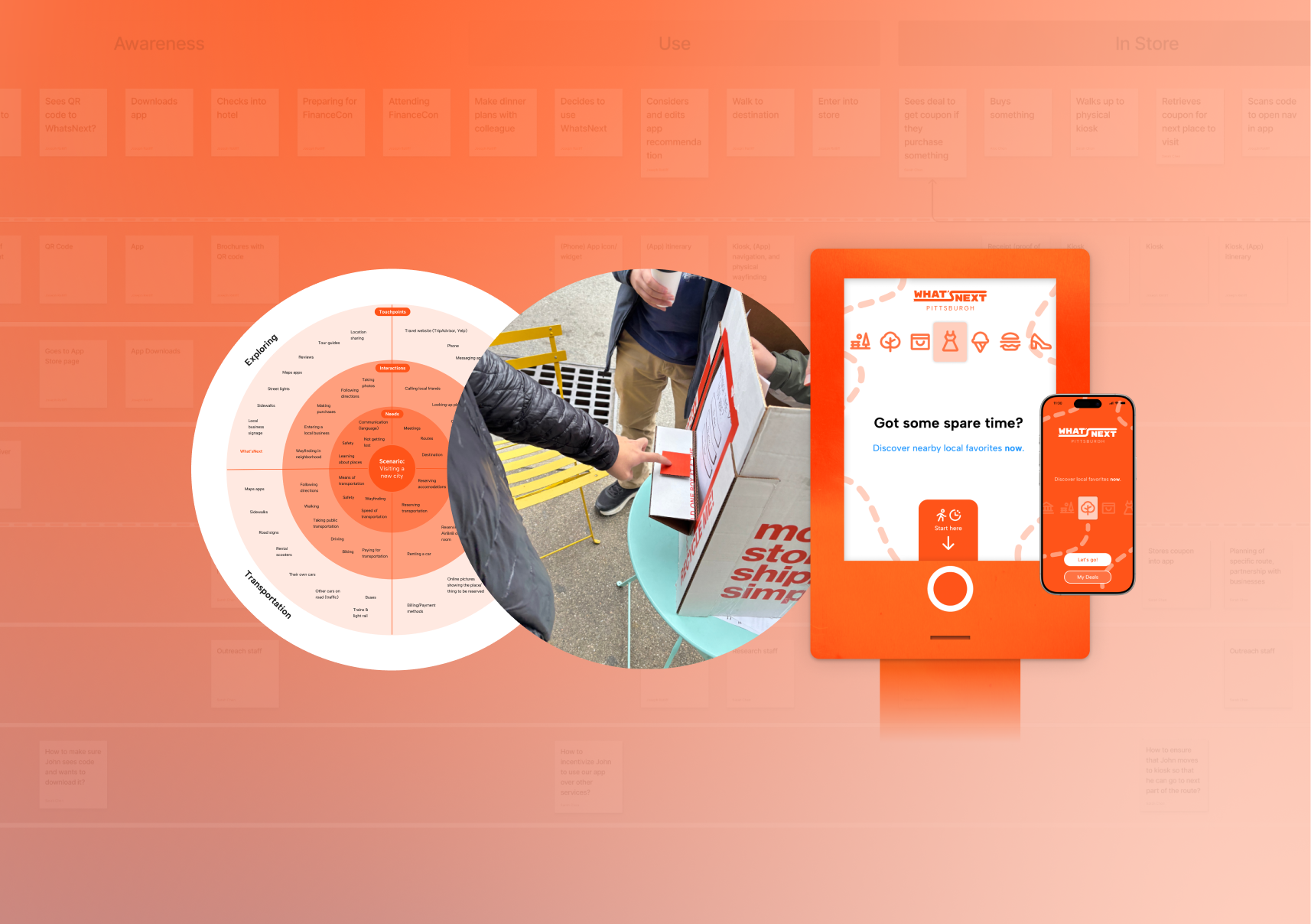
The Problem With Service Design: Being Actually Useful
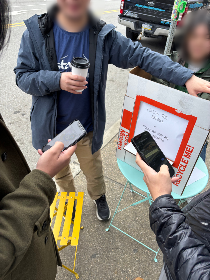
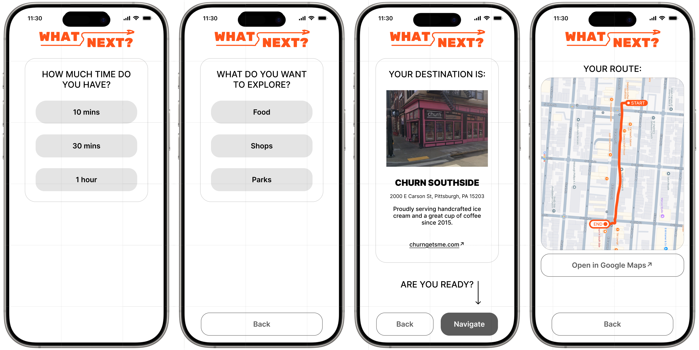
A question looming throughout this project was, "Why not just use Google Maps?" We attempted to answer this by using physical kiosks and targeting spontaneous activity to circumvent the choice paralysis one might get from seeing lots of options in a maps app. However, people already have these apps on their phones, and they already habitually use them for finding local businesses. This raises a broader question in service economies: how might we design new services when so many problems are already solved? Is the burden on us to find new problems (or to invent them)? What happens to a service economy when service systems are sufficiently robust, accessible, and automated with AI?
Attributions
Some icons sourced via Phosphor Icons
Some images sourced via Unsplash
Special thanks to Sarah, Alec, and Daphne