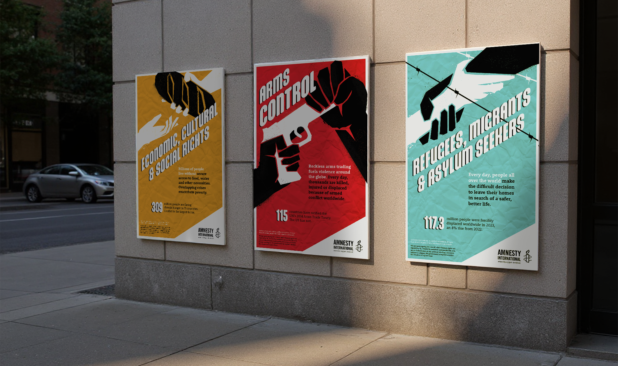
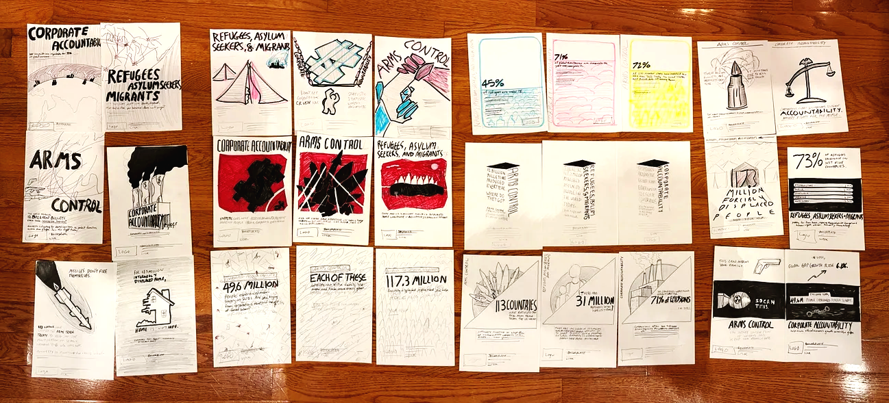
Amnesty International Poster Series

Carnegie Mellon MA in Design | September-October 2024
Graphic Design
Communication Design
Print
OVERVIEW
As part of a graduate-level studio course on visual communications design, I was tasked with creating a set of three posters based on Amnesty International’s focus areas.

The posters needed to contain the name of the focus area, a summary statement, a statistic, Amnesty's logo, and boilerplate text about Amnesty's mission.

To accomplish this, I rapidly learned and applied new ideas, skills, and tools through several rounds of iteration.

This case study is shortened for readability; find additional documentation here.
WHAT MAKES AN EFFECTIVE ADVOCACY POSTER?
RESEARCH & COMPOSITION
01

I started this project by researching posters with different compositions and seeing which caught my eye. This is arguably the most important function of a poster—to capture the attention of someone walking by. Without attention, information cannot be communicated.

Mono-focal posters—compositions which focused the viewer's attention on a single point—seemed to work best. Because this was an academic project, I took the liberty of assuming that what caught my attention would also catch others'.

I then sketched out 10 sets of 3 poster concepts, featuring a few statistics related to my chosen Amnesty International issues: Arms Control, Corporate Accountability, and Refugees, Asylum Seekers, and Migrants.

I chose these because they felt actionable and directly relevant to people’s lives. Arms need controlling, corporations need accountability, and refugees need support and asylum.
I narrowed my concepts down to a combination of multiple sketches, making use of both a strong diagonal and bold colors with black and white illustrated elements overlaid. I felt that a consistent angle to elements within the poster series would create a sense of unity and action.
GETTING IT JUST RIGHT
ITERATION
02
I refined the visual design of the posters through several rounds of iteration and critique.

In our first critique, reviewers noted a difference in display text sizes between my first draft posters, as well as visual differences between the illustration styles. Early adjustments included redoing the “arms control” fist-gripping-gun, replacing the “corporate accountability” dollar sign, and redoing the “refugees” illustration. Feedback on other iterations pointed out orphans in the text and consistency issues between elements of the illustrations.
I also added texture to the backgrounds. With a more “grunge” stylistic direction, I felt that a solid color was too artificial; graffiti in the real world is almost always sprayed on a textured surface.

To circumvent a tricky visual problem, I decided to pivot the “Corporate Accountability” poster to “Economic, Social and Cultural Rights.” I paired this topic with an illustration of bread; the most archetypal economic right is freedom from hunger, and the most recognizable symbol for food (in the West) is bread.

Beyond content and kerning adjustments, I made one more change to my typography — adding a black block shadow to the white display text. I came up with this by doodling on my poster iteration during class. It felt like it helped the type pop more, so I implemented it in the final iteration.
HOW MIGHT THIS MAKE USE OF EXISTING THEMES?
REFINING THE VISUAL STYLE
03
Halfway through the project, I realized I had inadvertently mimicked graffiti stencil art, including the iconic “raised fist” protest symbol. Because Amnesty is culturally tied to protest movements, I decided to lean in.

To mimic spray paint more convincingly, I needed to understand how spray paint behaved. Fortunately, my position as a design lab assistant allowed me to use a spray booth to test it for myself.

An expert at the lab told me political stencil art is often done hastily — someone slashes a piece of used cardboard with whatever knife they have, throws it up on a wall, and sprays over it. We had all the tools, so that’s what I did.
I learned that cardboard stencils often create a soft edge, and that spray paint can be dry and faded or dense and drippy, depending on paint quality, distance to the wall, and time spent focusing on one spot.

There’s an emotion to it as well; a sort of hasty anger hidden beneath a rushed creativity. The way you wave the paint, the force of it coming out, and the randomness of the splatter all lend to a sense of both fun and desperation. The possibility of paint dripping adds a potential for surprise.
I applied what I learned by making paint splatters, spray patterns, and drippy blotches in Adobe Photoshop and converting them into vectors in Illustrator. These added to (and subtracted from) the vector "cutouts" in the posters, making a clearer visual connection to graffiti stencil art and its associated protest culture.
REFLECTIONS
04
At the end of the project, I presented my work to my class. The posters were received positively, and I felt I had done the best I could do in the time I had.

I had done posters before, but I enjoyed learning about grids, kerning, and other fine-tuning design methods. It was great to tackle a project by shifting between Adobe softwares and balancing their differences.

I also gained an appreciation for iteration and synergy; my final poster concept came from combining two sketched ideas outside of the main iteration assignments.

It was also fascinating to see how my mind drew inspiration from things without me realizing it. It makes me wonder how much “original” creativity is simply unintentional emulation. If creativity in advanced societies is unavoidably collaborative, it may be fundamentally out of step with the intellectual property laws underpinning the modern creative industry.