
ROLES
UX/UI Design, Web Design, Graphic Design, Product Strategy
DELIVERABLES
UI Mockups, Code Updates, Components, Landing Page, Web Banners, Social Media Creative, Print Flyers, Newspaper Ads, HTML Email Templates
TOOLS
Figma, Claude Code, HTML/CSS, Drupal, Github
TIME
Jun–Oct 2026
COLLABORATORS
Clare Ashcraft (PM), Evan Wagner (PM), Molly St. Louis (Creative Strategist), Tatiana Bobritsky (QA), Scott McDonald (CTO)
OVERVIEW
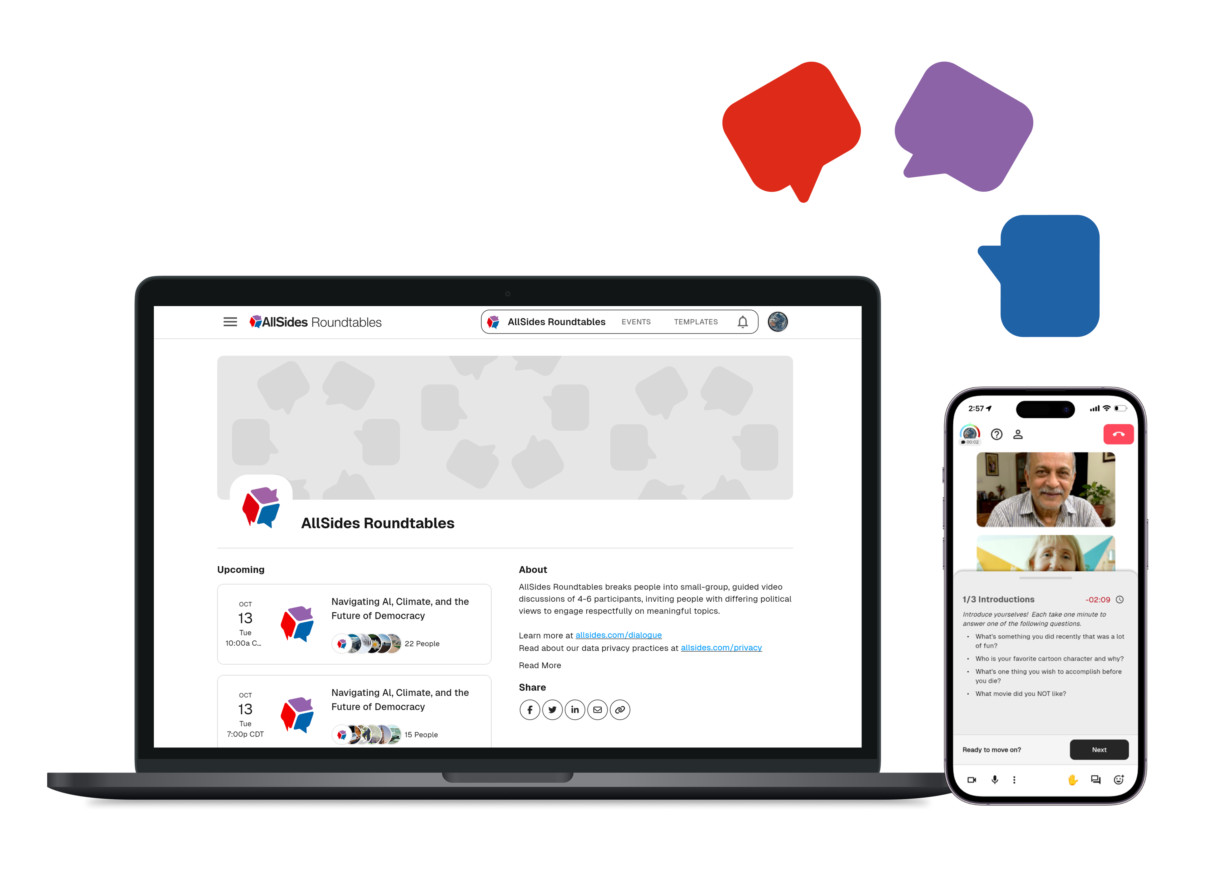
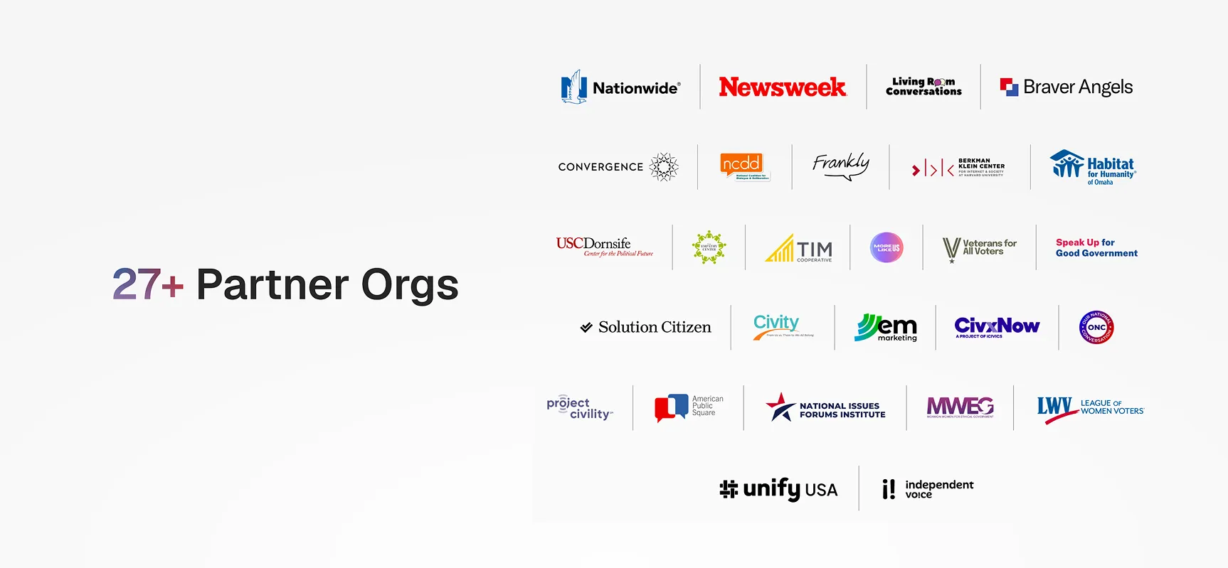
As AllSides’ in-house Product Designer, I supported both UX/UI updates and marketing for AllSides Roundtables, a public dialogue events webapp. To establish Roundtables as a robust B2B and B2C product, I also supported event series like the National Roundtable on the American Dream — a civic dialogue event series backed by 27+ civically-minded organizations like Newsweek.
Sign up for an event at roundtables.allsides.com.
Note: AllSides Roundtables was initially based on a beta version of Frankly, an open-source public dialogue platform created by Harvard University’s Berkman Klein Center for Internet & Society.
IMPACT
- 35+ civic org event partners secured, including Newsweek and Nationwide Insurance, across 5+ paid client event series
- Marketing creative assets posted by external partners to promote events, reaching
- 1000+ participant signups for the National Roundtable on the American Dream event series
- 15+ pull requests approved and merged into production code for a web app, including a video call interface and event signup platform
Touchpoints
Designing & Building Across Mediums
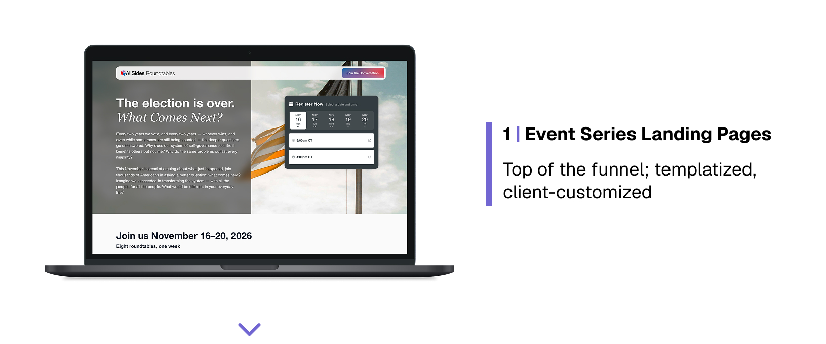
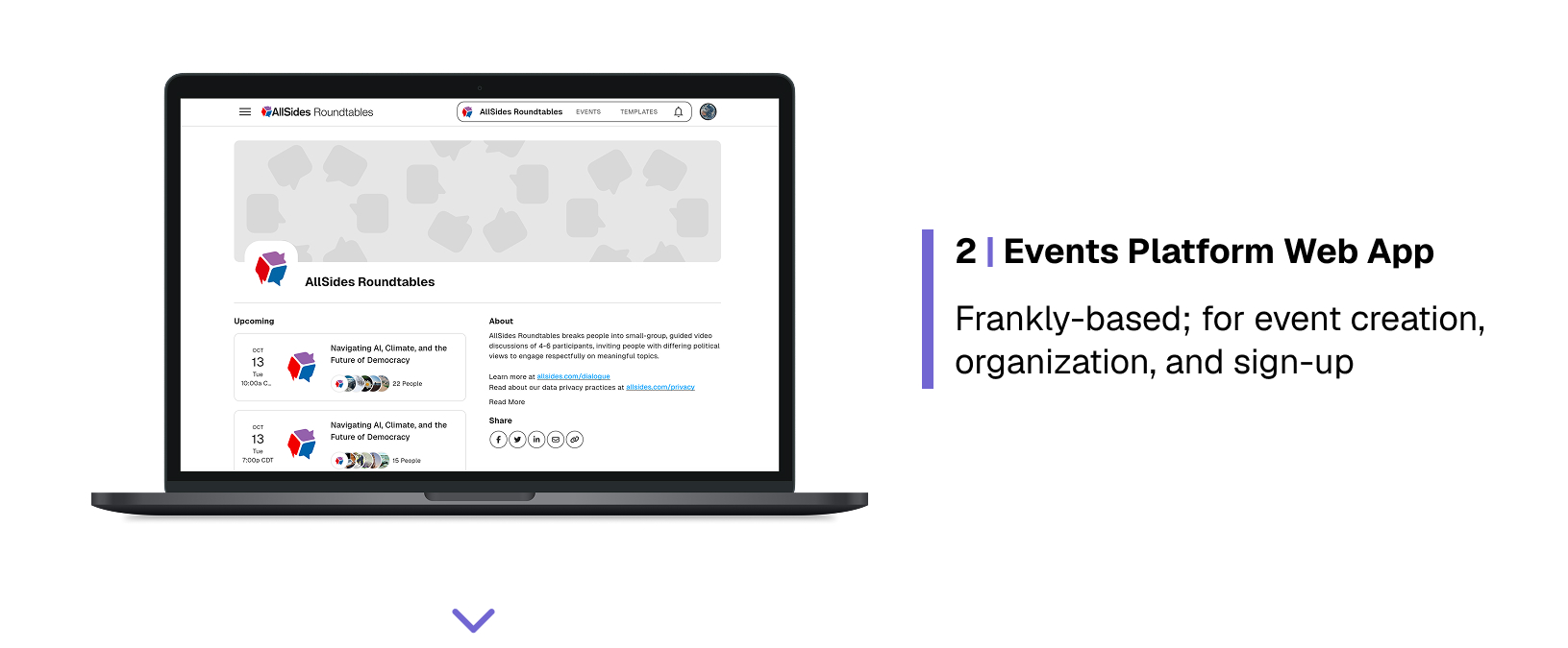
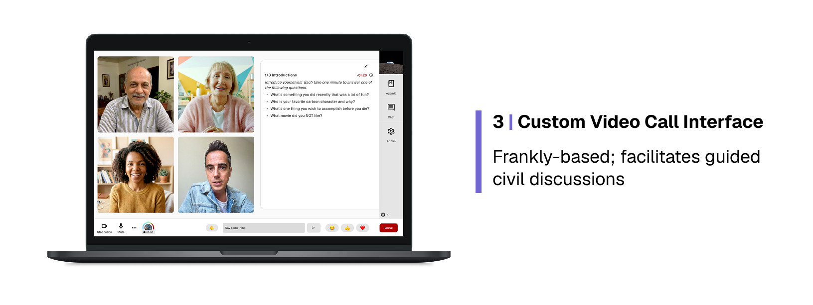
I co-created with a cross-functional agile team across HTML/CSS and a Flutter web app, connecting three main touchpoints into a cohesive flow: landing pages, an events management platform, and a video call interface.
Research & Stakeholder Alignment
Understanding a Live Product
I joined this project after the app had been live for about a year, with the team looking ahead to big event series and product updates. I set out to rapidly learn about our existing users, business goals, and product functionality.
Understanding Our Users
I gleaned from prior events’ demographic survey data that our current power users were mostly older and highly-educated, with a personal interest in strengthening civic society. While these users had prior exposure to video call interfaces, familiarity with technology was not guaranteed.
(Note: There may have been some reverse causation here; event leaders often scheduled Roundtable events for times when working-age people are less available, like 10am on a Tuesday.)
Working with internal stakeholders, I gathered that we eventually wanted to appeal to high school students, community organizers, business leaders, and general-public political hobbyists.
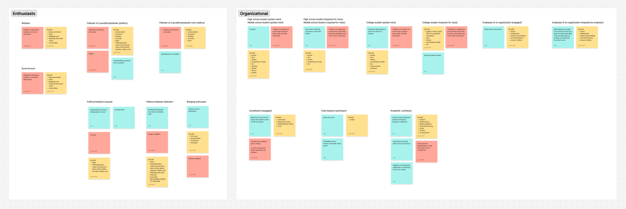
Outcome of a short workshop identifying user groups, with attributes and values for each
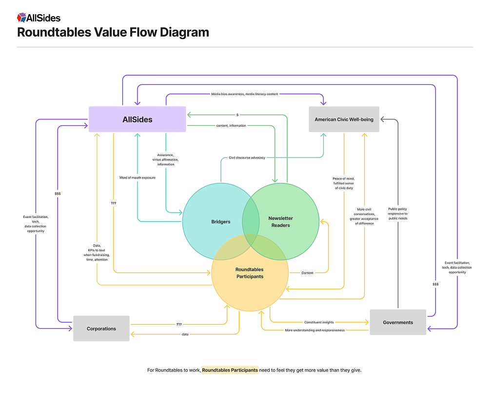
An exploration of value flows for a proposed integration with AllSides newsletters
Testing
I participated in several rounds of testing, focusing on usability while developers checked for technical errors. User testers were company employees — representing a mix of genders, ages, and levels of familiarity with the platform.
While we operated without a dedicated research budget, we did have the benefit of a small user base attending events on the platform. I drew product insights from feedback our team received during various small-scale dialogue events.
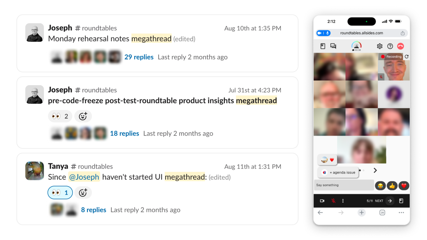
Slack messages and a screenshot from internal app testing, during which I identified UX and UI issues.
Problem Definition & Iteration
Aligning, Clarifying, Polishing
Participant users were generally in the app for one reason — to have enriching guided conversations. I set out to identify and prune anything inhibiting that experience.
Internal stakeholders hoped this app would attract significant organizational interest, and feedback from partner organization representatives showed that the user experience impacted their decisions. Making flows feel smooth, polished, and professional helped encourage organizational clients.
Core Participant User Problem
A cluttered mobile video call interface — low signal-to-noise ratio — makes interaction confusing, introduces a learning curve for the majority of users (who are usually first-time), wastes their time, and distracts them from their conversations.
UI Problem
Solution
Too many controls, packed densely, with small touch targets, on top, bottom, and middle of screen
Couch conversation-irrelevant controls in menus, map controls to common patterns
Advance-agenda controls glitchy and duplicated in agenda panel and bottom control bar (admittedly due to my own previous solution)
One advance-agenda interaction, mapped to the agenda panel it controls
Speaking indicator badge obstructs view of speaker on small screens, and uses a confusingly static waveform icon
Speaker indicated with video tile outline
Add gaps between video tiles for clearer differentiation
Add gaps between video tiles for clearer differentiation
Having too many video tiles onscreen makes tiles too small and draws the user’s eye away from the speaker
Introduce a maximum number of video tiles onscreen (using existing pagination and scrolling rows)
Admin’s breakout room reassignment controls are cumbersome on mobile because they require typing
Apply existing breakout room button-grid display pattern to Admin’s room reassignment screen
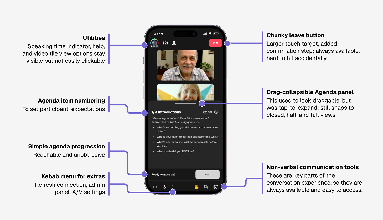
The Roundtables mobile video call experience, annotated, as of Fall 2026
Core Product Problem
The app still felt like an early beta, but the company wanted to sell business clients on it — and attract lots of individual users, whose eager participation would be essential for most B2B cases to make sense. Roundtables needed to feel like a polished product.
UI Problem
Solution
Default fonts and colors bore no affiliation to the AllSides brand
Added on-brand Tailwind color palette, switched Google Fonts connection
Risk of users getting lost in redundantly-named, sparsely-connected layers of information architecture
Stopped the bleeding by blocking off obvious exits from the “Space” housing the American Dream event series; Later, added clear pathways around the platform, including Featured Spaces on the home screen
Confusing, unintuitive, or irrelevant navigation
Reworked the nav bar to visually associate Space-related nav items, distinct from platform-wide items and menus; renamed several items for clarity (e.g. “Communities” functioned like event templates, so renamed as “Templates”)
Lack of clear partner attribution risked straining company relationships
Added clear attributions — with links, logos, and contributions — in several places across the app and associated web pages
Simple, empty interfaces felt less robust than other event platforms and video call apps
Sorted through misaligned design tokens to add a dark mode, tuned commonly-used interfaces, and redesigned components for Space home screen cards, Space pages, Event cards, and more
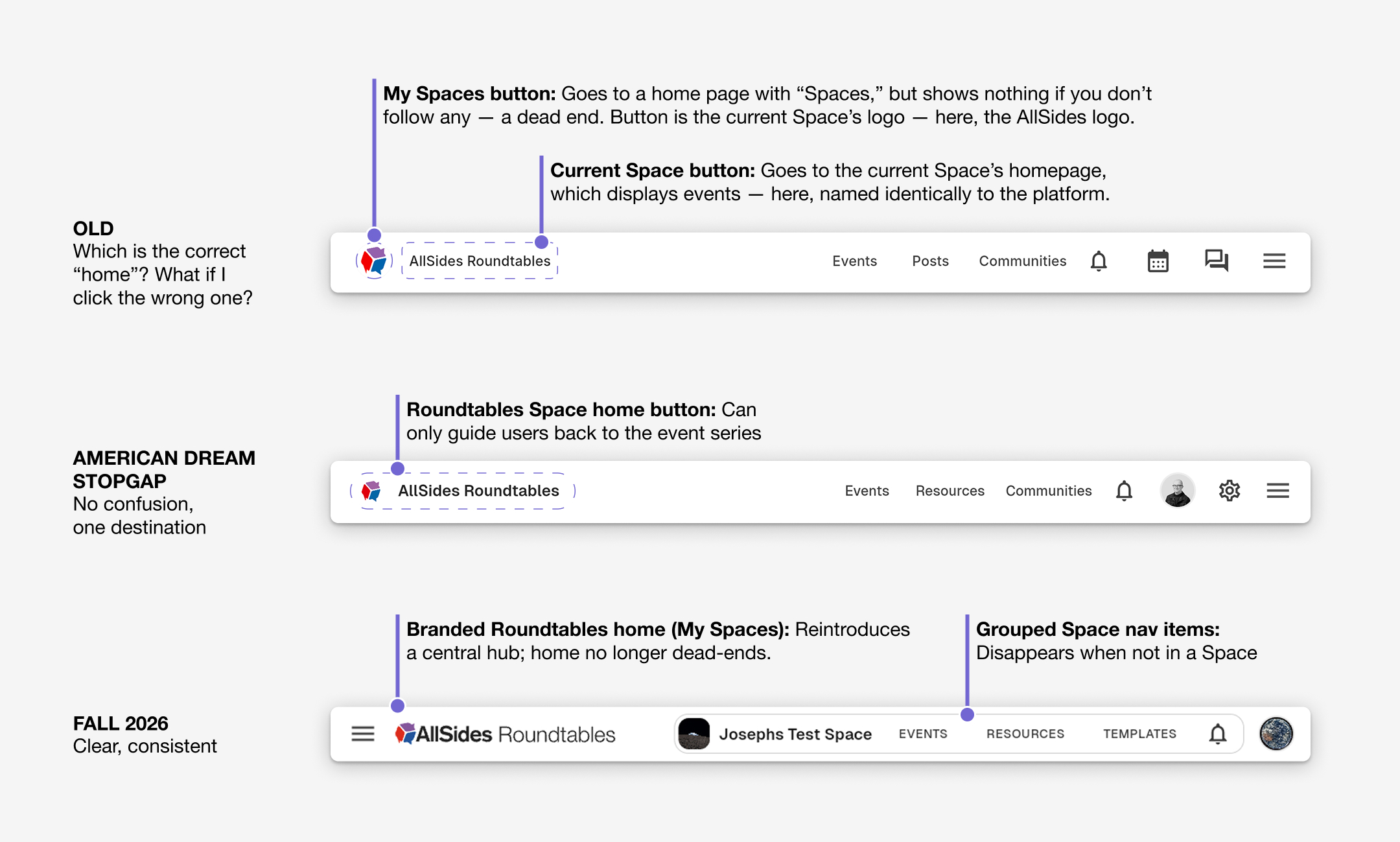
Platform nav bar iterations (desktop only)
Concise Transparency
Targeted Privacy Policy Notification
Users are increasingly privacy-conscious, and AllSides wanted to be a privacy-first company. The platform and event surveys collected demographic data and video/audio recordings, so we needed to clearly communicate data privacy information without overwhelming users.
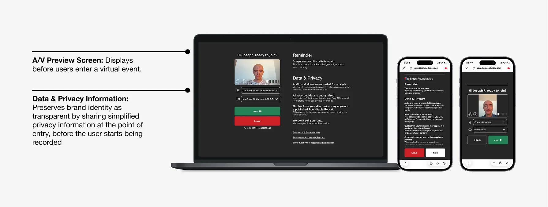
Privacy information written and designed by me, to ensure transparency of data policies
Marketing
Acquiring Partners and Participants
Much of our work was motivated by preparations for AllSides' National Roundtable on the American Dream; to be successful, this event series needed a large number of participants and partners to help get the word out.
Landing Page
We needed a dedicated promotional web page we could direct partners and participants to. This needed to explain, legitimize, and generate excitement about the event.
After consulting with the marketing team through several iterations, I elevated the final content outline to a live web page.
Designing in Figma and building in Claude Code, I combined existing styles from our Brand Guidelines with a heavy use of video and images — a relatively new visual pattern for interfaces at AllSides, where content had been mostly text-based.
Once launched, the landing page played a key role in the company's efforts to partners, who in turn promoted the page to attract participants.
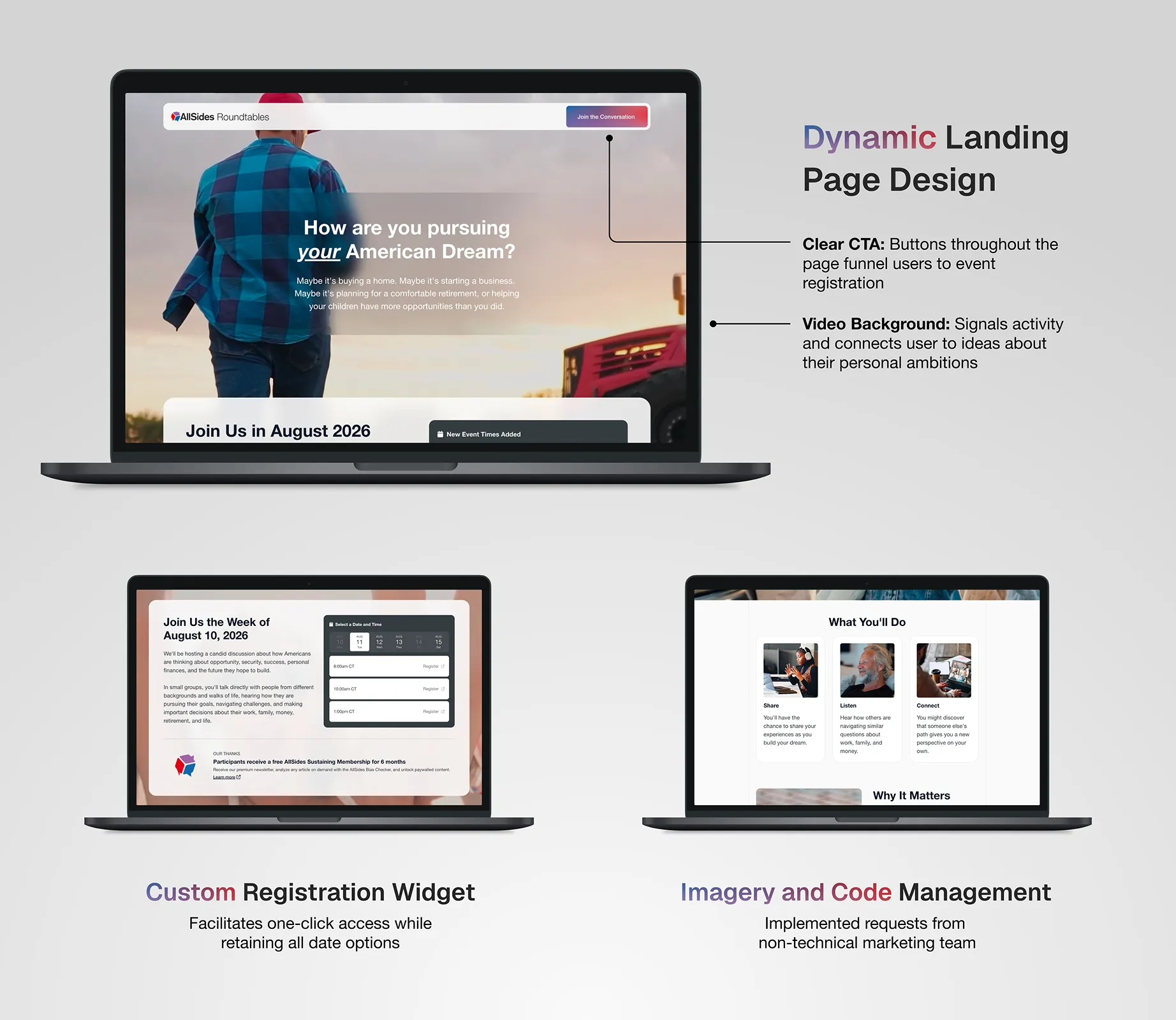
The American Dream event series landing page, viewable at allsides.com/american-dream
Marketing Creative Assets
Once we had partner organizations, we needed content for them to promote the event to their audiences. I applied the style of the landing page to create assets as the marketing team requested them, including website banners, email banners, social media image posts, newspaper ads, and more.
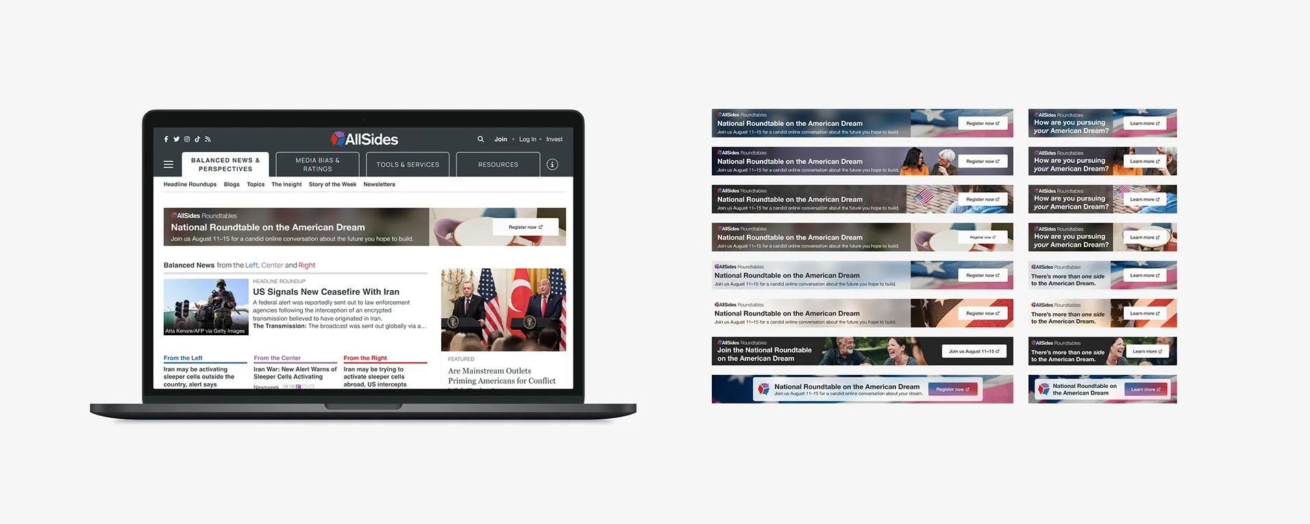
Web banners for desktop and mobile
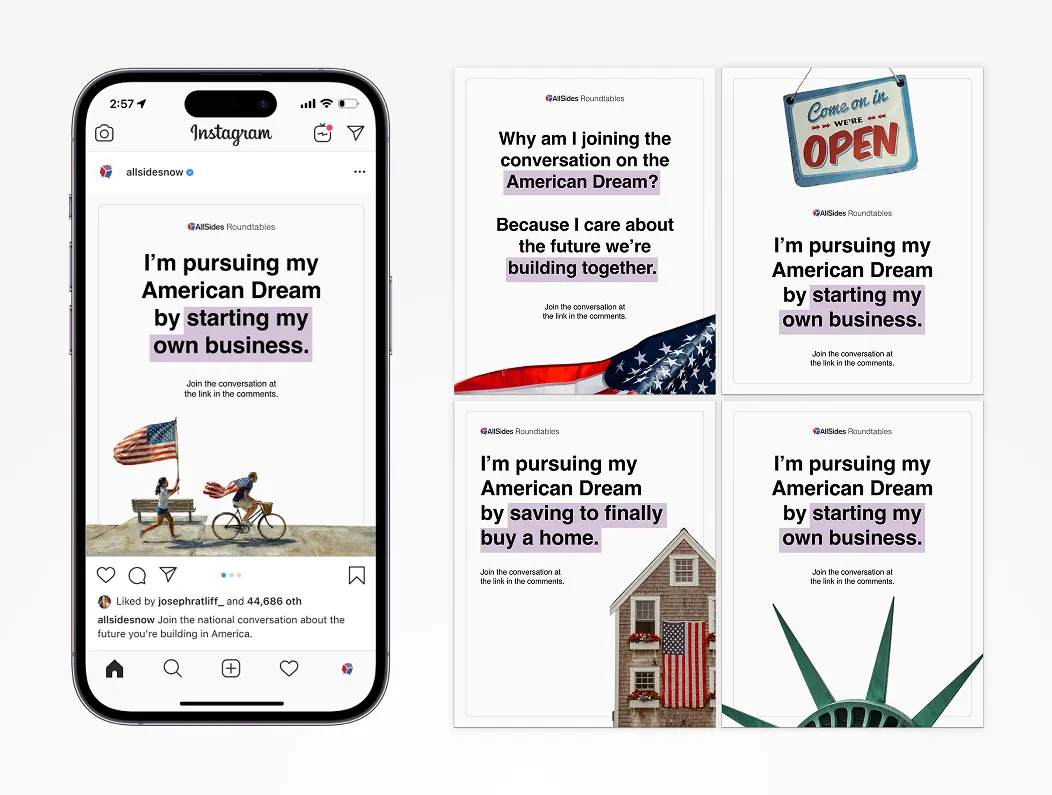
Shareable social posts designed to accompany the event series
Empowering Partner Outreach
Using the landing page and marketing assets, the marketing team secured 27+ partner organizations for the event, many of which used these assets to promote the event to their audiences.
REFLECTIONS
Bridging Across Marketing, Product, & Dev
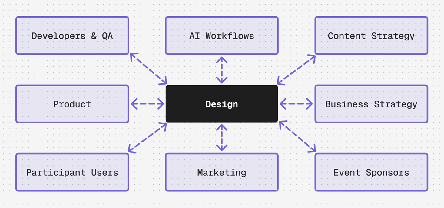
My role on this project was fully cross-functional; along with the usual product and marketing collaboration, I leveraged Claude Code to work directly with developers — testing product changes locally, pushing PRs, completing dev tickets, and joining daily standup meetings. I had never even heard of Dart before, but I successfully shipped frontend code for a Flutter webapp with 1000+ users. I wasn't yet "technical," per se, but I had entered the semi-technical twilight zone many designers found themselves in as coding agents improved. I worked at the level of product managers, despite still technically being an individual contributor.
If I had to do it all over, I think I'd try to 1) ground my involvement even more in diagrams and other collaborative alignment tools, and 2) be more confident in my product judgement. Alignment suffered because the business strategy pivoted a few times throughout the project; more artifacts like service maps, value flow diagrams, and user flows might have limited cross-department miscommunication. While I helped establish a product vision, roadmap, and value proposition as I became more involved, this project would have benefitted from my insisting on those things at the start.
As AI workflows speed up development cycles, alignment-focused design leadership will only become more important, and I look forward to exercising these skills in future projects.