
ROLES
Research, Brand Design, Product Design, UI Design, Visual Design
DELIVERABLES
Brand Guidelines Documentation, Mailchimp Templates, Canva Templates, Graphic Asset Libraries, Frontend Components, Web Extension
TOOLS
Figma, Canva, Mailchimp, HTML/CSS, Drupal, Astro, Github, Weavy, Claude Code
TIME
Jan–May 2026
COLLABORATORS
Nikita Tselovalnikov (Senior UX/UI Designer)
OVERVIEW
By 2026, AllSides had served hundreds of thousands of users over a decade with cross-partisan news content and media analysis. However, it was growing in areas like civic tech and B2B services, and internal teams often used different elements for designing digital products, marketing assets, and other artifacts.
With experience across writing, UX/UI, and visual design, I was well-positioned to investigate these teams' needs, build an understanding of the brand narrative, and craft unified design standards, assets, and components that brought the whole company together.
IMPACT
- Delivered Brand Guidelines and 10+ asset libraries to marketing and content teams
- Created 10+ templates for social posts, used by teams daily to promote content to profiles with up to 272k+ followers
- Updated frontend code for a website reaching 4M+ monthly unique visitors, editing stylesheets and building new components to address content team needs
RESEARCH
What is AllSides? What do its people need to succeed?
The core of this work was about understanding the story of this brand. What did AllSides stand for? What did it want people to feel about it? What associations did it want to emphasize or avoid?
Metaphors
Brands often rely on metaphors and allegories to make their stories explainable to the broader public. To help tell AllSides' story, I asked staff to describe some metaphors for AllSides and its various product arms. These included:
Reading AllSides news content
- Meeting with a nutritionist and creating a balanced diet plan for yourself
- Standing on a balcony overlooking the whole political news landscape
Using AllSides bias ratings
- Holding a temperature gauge for political perspectives
- A file system that organizes media sources by their historical, measured bias
A media company purchasing an AllSides bias audit
- It's like the accessibility audit for a website
- A fire department hiring a PR firm to help convince the local community to see their value
- A third-party inspection before selling your home
- Getting a report card
- Please audit my company's finances and tell me if I emphasize particular kinds of investments
A school working with AllSides for Schools
- It's like learning to use EbscoHost from your school librarian
- A business hiring a consultant to help serve their clients better, through unique insights that only that consultant can provide
- Teaching students to use a compass before sending them into the news media wilderness
- Building media literacy muscles before entering the information gym
Understanding Limitations
I also needed to understand what was realistic for employees to implement. As a company with limited resources and a range of skillsets, understanding these internal users' capabilities was an important research goal. Most people dealing with graphics use Canva, so I integrated the Brand Guidelines directly in Canva for use in working files.
ART DIRECTION
Applying Metaphors and Identity to Visual Style
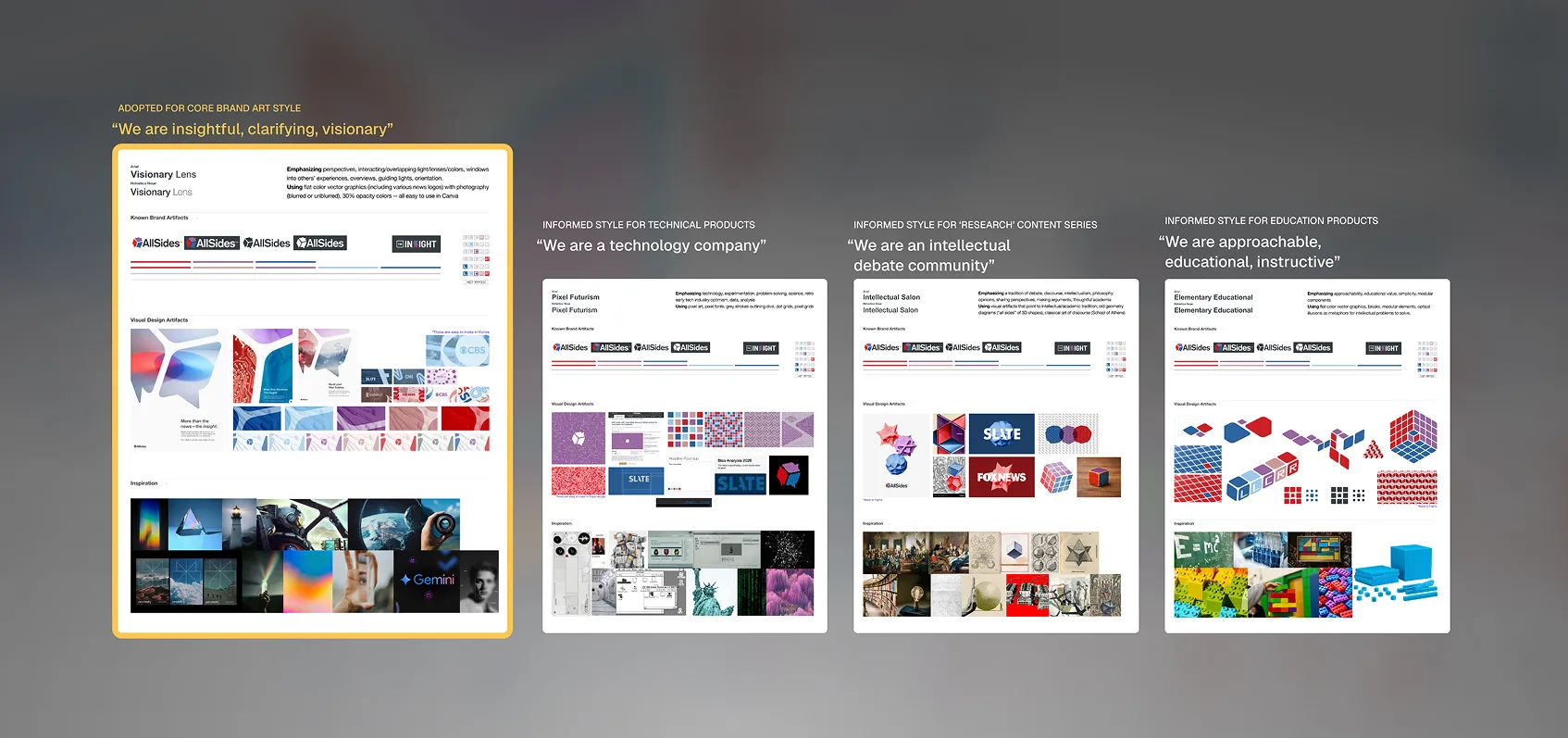
Responsive to my research and collaboration with a senior designer, I created four potential art directions that emphasized different stories about AllSides' identity.
We ultimately went with a “lens” visual metaphor, leaning into AllSides' motto of “getting the full picture,” as well as the necessity of implementation in Canva, where more advanced design techniques were limited.
Because this approach was unspecific, it could encompass the full range of different stories the various arms of the company were telling: news analysis vs. media ratings vs. civic dialogue events vs. B2B SaaS.
Adapting Existing Design Elements
AllSides had come to rely heavily on a set of 3–5 colors — red, purple, blue — for both its brand and its signature media bias ratings. To provide flexible structure and facilitate a wider range of on-brand visual expression, I created an expanded bias palette with lighter and darker values of these core brand colors.

Flexibility Across Departments
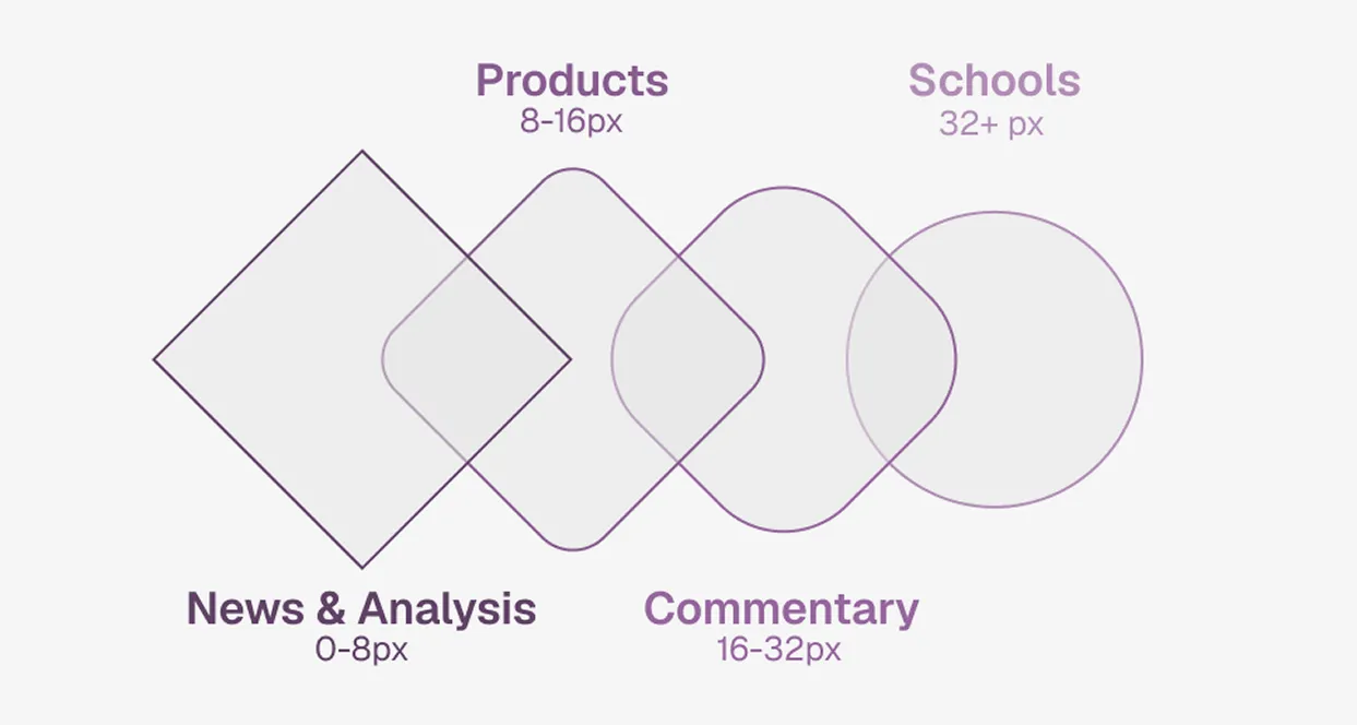
While some products needed to communicate seriousness and reliability, others needed to be friendly and approachable. Corner radii, color, and fonts all provided ways of differentiating these products.
BRAND GUIDELINES
Packaging Standards for Internal Use
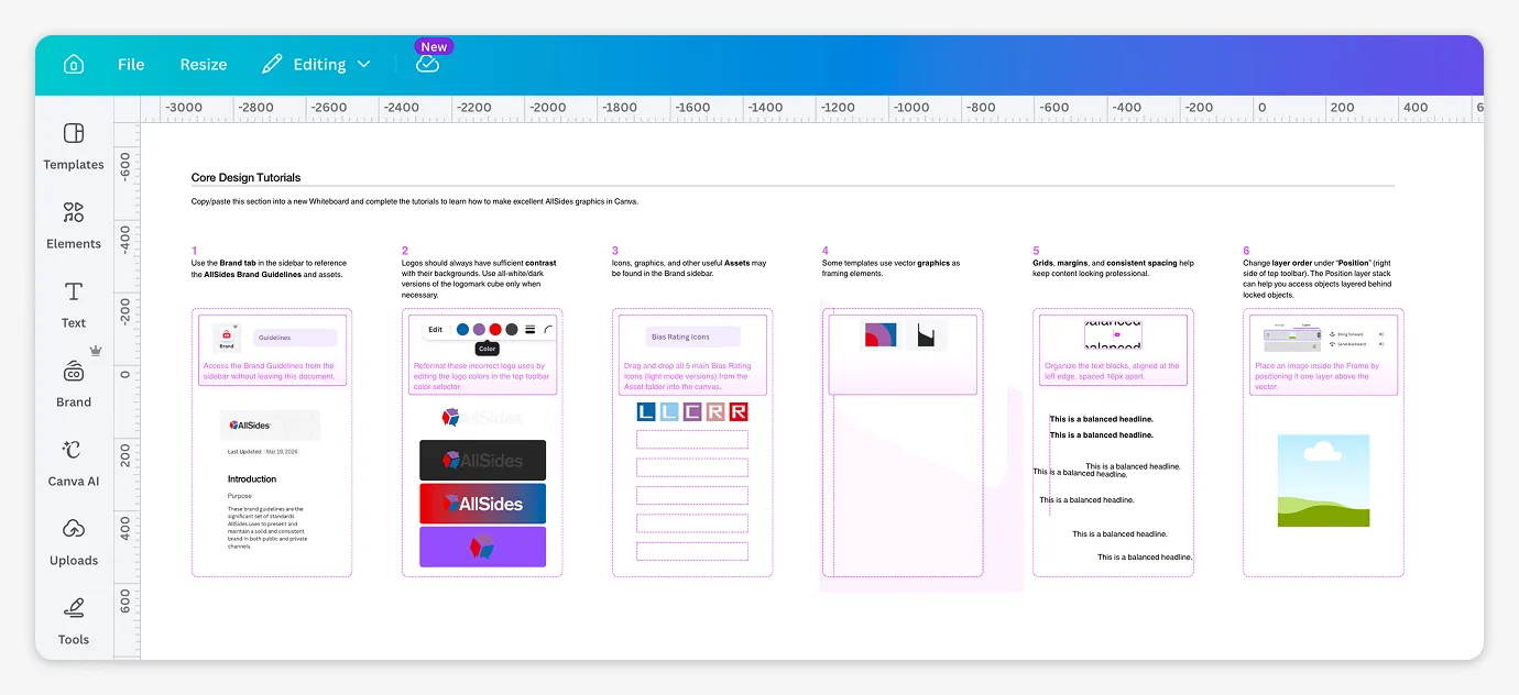
The core product of this work was a Brand Guidelines document integrated with Canva, the only design tool most of the content and marketing teams used.
This document brought together an understanding of the brand story, style direction for graphic elements, and stricter rules about the use of logos and brand colors.
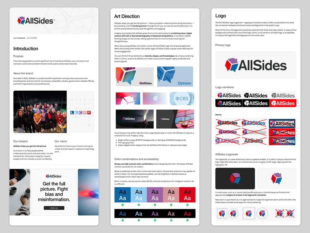
I presented the new guidelines to company executives and created a short explanatory video to train content and marketing teams. I also created a hands-on tutorial file in Canva to teach skills teams would need to use assets and templates created with these guidelines.
GUIDELINES IN USE
Applying Guidelines and Art Direction to Useful Artifacts
I applied this visual style in a range of initial assets, including building blocks and finished graphics.
Some of these atomic design elements took inspiration from a geometric metaphor of AllSides as "all sides," particularly the logomark cube, playing into users' values of curiosity, learning, and exploration of unseen aspects of complex topics.

Content & UI Updates
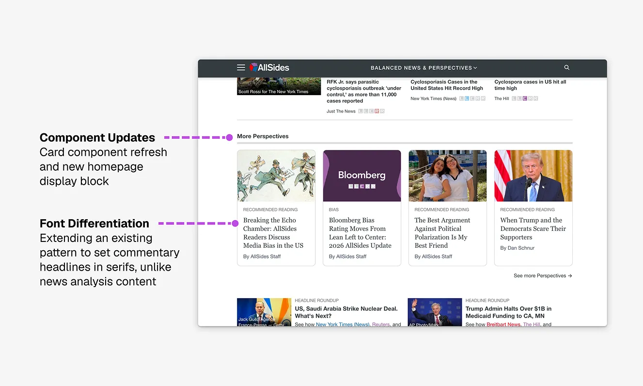
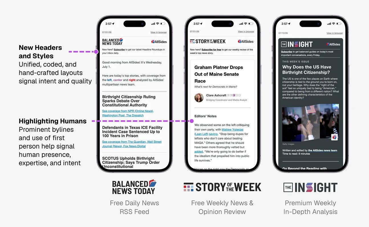
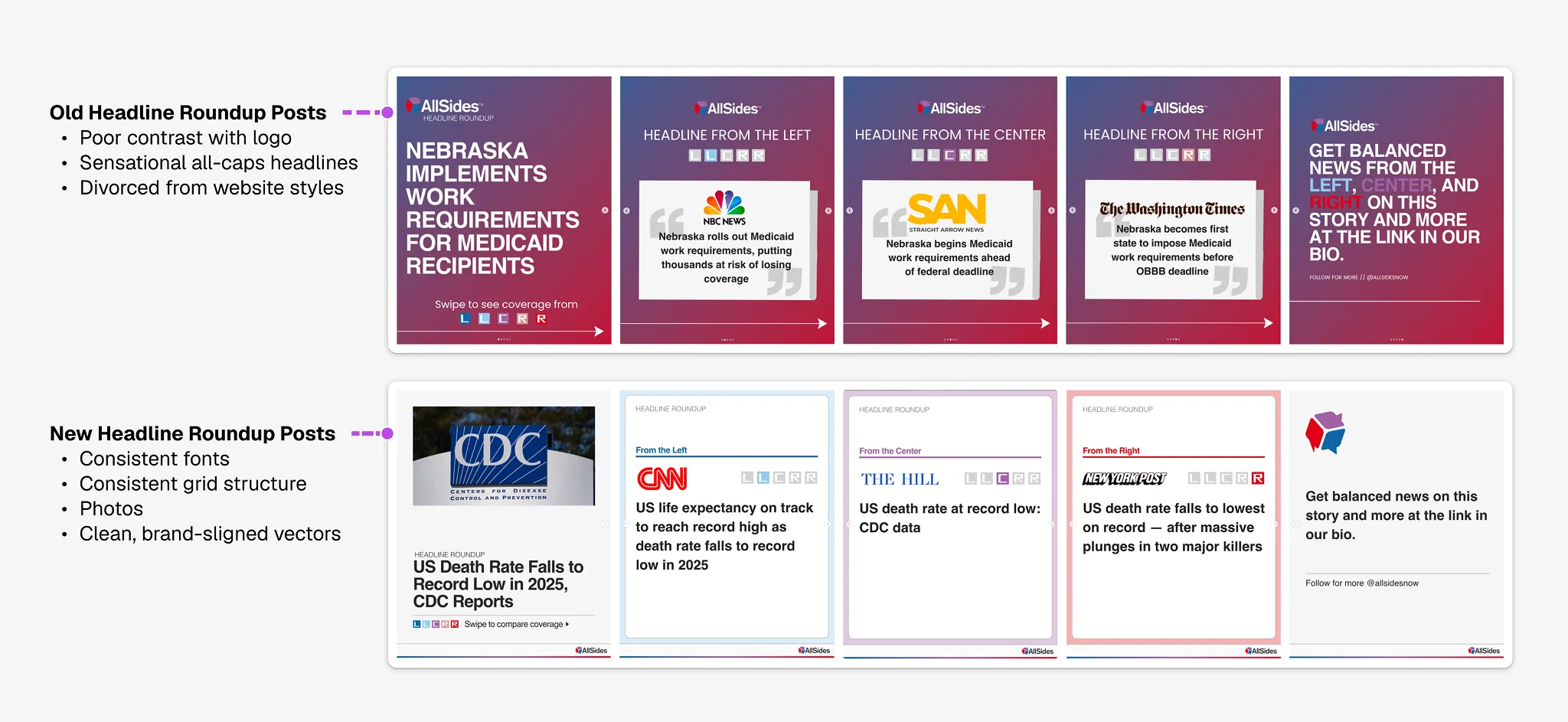
Following the guidelines' release, much of my role involved bringing web, newsletter, and social content into alignment with brand styles.
Working with Claude Code, I responded rapidly to requests from internal stakeholders, designing and shipping to elevate and boost visibility of key news analysis content.
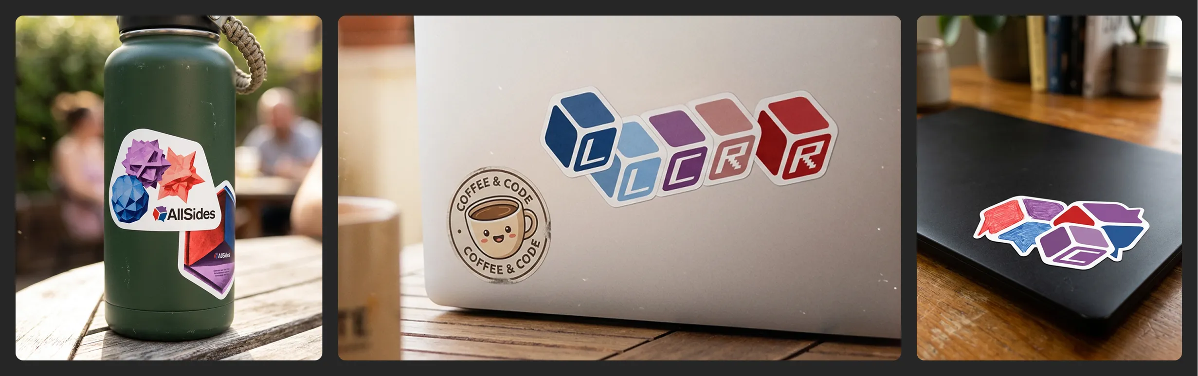
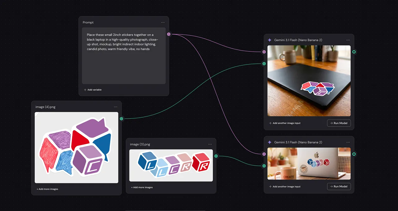
Merch and Visual Assets With AI Workflows
With design guidelines, a library of assets, and an understanding of the brand story, I could wield AI tools like Weavy and Claude Code in targeted ways to create brand-aligned visual assets, interfaces, draft design.md files, and internal tools.
NEXT STEPS
Where We Go From Here
The MVP guidelines were a big step forward, but they also left much to be done.
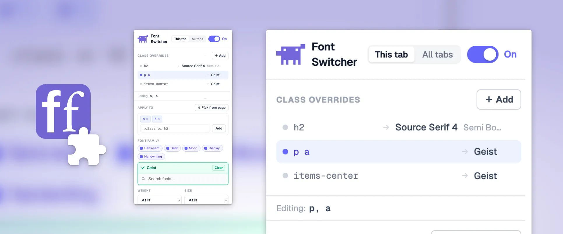
While guidelines in Canva serve the content and marketing teams, product and engineering teams need design rules in the language of code. I am working with these teams to build solutions, like Figma component libraries, design.md files, and internal tools for testing future design system updates.
REFLECTIONS
The Utility of Cross-Functional Alignment
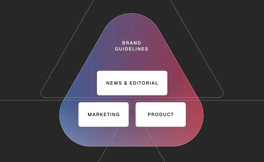
In an age of AI-fueled software abundance, as in decades past, intentionality, purpose, and focus are key differentiators between amateurs and professionals. Maintaining these qualities in organizations requires alignment work — especially when organizations grow beyond the 12–15 person threshold under which people can comfortably share a meeting space equally.
That's where AllSides was when this project began. It was no longer sufficient for one person to decide on their own how the company should be represented in their own siloed area — an alignment artifact was needed to keep everyone moving in the same direction. These guidelines, and my ongoing work, aim to serve that organizational function, for the ultimate goal of a cohesive public brand narrative.